...
Zoom Chart
| HTML Table |
|---|
| border | 0 |
|---|
| cellpadding | 0 |
|---|
| rules | none |
|---|
| cellspaceing | 0 |
|---|
| frame | void |
|---|
|
| Table Row (tr) |
|---|
| Table Cell (td) |
|---|
 Image Removed Image Removed Image Added Image Added |
|
| Table Row (tr) |
|---|
| Table Cell (td) |
|---|
| Center |
|---|
Sales by Territory color coded by Product Line |
|
|
|
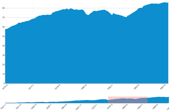
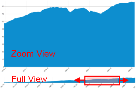
A Treemap displays hierarchical information in a series of clustered rectangles, which together represent a whole. The size of each box represents a quantity. Treemaps also can use color to represent any number of values, but it is often used to categorize the various boxes within the treemapAn interactive line chart that allows you to view the trend across a large data set and select areas to display in the Zoom area.
Get Started
Step 1: Download\ the plugin
Step 2: Follow the simple instructions for adding the plugin to your existing Pentaho BA Server
Step 3: Get Creative - explore your data, build cool stuff, amaze your friends and co-workers!
Working With
...
Zoom Charts
| HTML Table |
|---|
| border | 0 |
|---|
| cellpadding | 0 |
|---|
| rules | none |
|---|
| cellspaceing | 0 |
|---|
| frame | void |
|---|
|
| Table Row (tr) |
|---|
| Table Cell (td) |
|---|
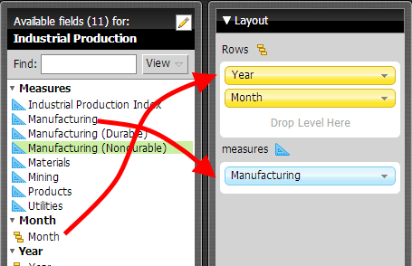
- Drag one or more attributes into the "Data Points" shelf of the layout panel to define which members you wish to plot. Note that when using more than a single attribute, the outer-most attribute will be used to color code the treemap
- Drag a measure into the measure shelf.
|
| Table Cell (td) |
|---|
- Click on one or more boxes in the treemap to filter data using the fly-out filtering bar (Keep Only|Exclude|Clear Selections)
- Double-click on a box to drill into the hierarchy (assuming you are analyzing a Mondrian cube containing hierarchical dimensions).
|
|
|
...


