...
- Unzip the Pentaho PCI and run through some of the samples, using the Pentaho Getting Started Guide to guide you. The sample databases will be started as part of the PCI startup process. For this exercise, you only need the PCI sample data, which can be downloaded separately. I recommend you use the PCI because a natural next step after following this exercise will be to publish your report, and the PCI is the easiest place to publish your report to.
- Unzip the Report Design Wizard, using the Pentaho Report Design Wizard Guide as your guide.
- Run the Report Design Wizard ( execute the reportwizard.bat|.sh file).
- Choose "Blank Template", then click the Next button.
- On the Data Source and Query tab, I chose JNDI, and selected the SampleData dataset.
- On the same step in the wizard, I defined the following query in the Query Details box:
Code Block SELECT REGION, DEPARTMENT, ACTUAL, BUDGET FROM QUADRANT_ACTUALS
- Click Next. The next step defines the report layout. Move Region and Department to the Group By box, and Actual and Budget to the Selected Items box.
- Click Next twice, skipping steps 5 and 6. These steps require no changes for this exercise.
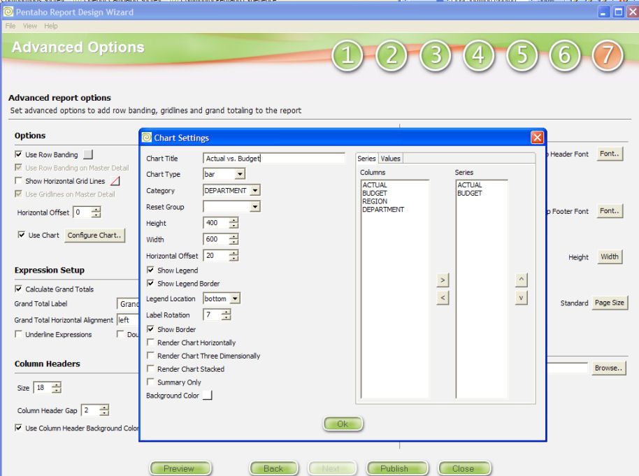
- Step 7 is where we have been wanting to go all along. It is here that you can define a report level chart. Under the Options section, check the Use Chart checkbox.
- Click the Configure Chart... button, which should give you the Chart configuration dialog.
- In the Chart Title text box, enter "Actual vs. Budget".
- For Chart Type, accept the default "bar" type.
- The Category is the column from your SQL query that defines the data groupings for your chart series data. We want to see actual and budget by region and department, so choose DEPARTMENT from the Category combo box.
- Move Actual and Budget from the Series Column list to the Series list. Do the same on the Values tab. These will be your data points.
- The Horizontal Offset setting aligns the chart horizontally in the report. To obtain the look that the chart is centered, I will set the Horizontal Offset to 20.
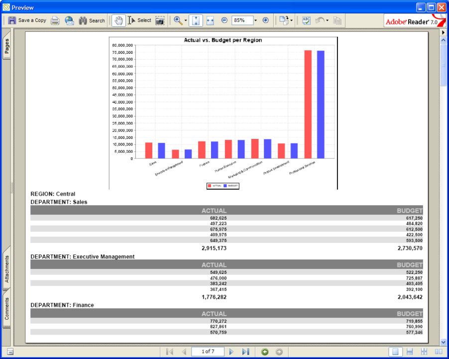
- Accept all other values as defaults for the chart settings. Click OK on the Chart Configuration dialog, and click the wizard's preview button to see what we have so far.
- So that looks good, you say, but the actual and budget values are aggregated for all regions, which isn't quite so useful. What we really want to see is a chart graphing actual and budget per department FOR EACH REGION. Here is where we will explore group level charting.
- Start by UN-CHECKING the Use Chart checkbox on Step 7 of the Wizard. That is the report level charting and we aren't interested in that anymore (fickle report designers aren't we?

- Go to Step 5 in the wizard by clicking on the "5" at the top of the window.
- In the Groups box, you should see Region and Department. Click on Region and look at the right side of the window. You should see a Use Chart checkbox! Woohoo! Check that checkbox, and Click the Configure Chart button. You should see our familiar Chart Configuration dialog.
- We need to do things a bit (not much) differently, since we are creating group level reporting. Our chart title (Actual vs. Budget), chart type (bar), and Category (department) are all the same, so set them now.
- Move Actual and Budget from the Series Column list to the Series list. Do the same on the Values tab. These will be your data points.
- The key difference and the magic behind group level reporting is the Reset Group. The Reset Group option indicates the parameter that triggers a new set of data for each chart. For our exercise, that would be the Region, right? Go ahead and set the Reset Group to Region.
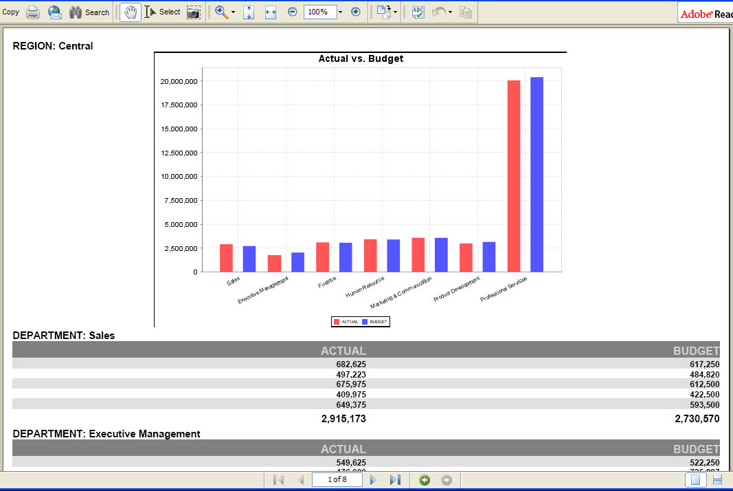
- Click OK to exit the Chart Configuration dialog. Click the wizard's preview button to see what we have now.
- Much better! Now we have actual and budget data by department for the region Central. If you scroll through your report, you will see for each region grouping a chart displayed with the appropriate contextual data.
...


